As kids, or as grown up adults, we very well know that the best way to teach anyone anything, is with the help of graphics, and visual tools. Charts, pictures, tables will convey the message 5 times better than plain long text. It becomes very essential to understand that our human brain tends to look for the easiest way to learn anything, and graphics are the best that depict anything. Consider anything, we have graphics everywhere, may it be books, internet sites, movie posters, everywhere. Interactive and creative text will be producing some wonderful results for you, as a marketer, as a teacher, or as anyone who wants to convey something to an another entity.
The technique of representing data is the technique of data visualization. There are a lot of charts, tables, like a pie chart, a relational table, an ER table, and a lot of other stuff, which can help you achieve data visualization in no time. When implementing data visualization, you have two pathways to take, the first one being the traditional way of using the basic level graphic designing tools like paint, office, etc. and the other new fast and efficient way is to use the specialized data visualization tools, which just need the data inputs and the domains about the data, and the type of visualization that you require, and it produces the desired type of visualized data form for you.
There are a lot of data visualization tools in the market, and some of them being expensive and useless ones. We have prepared a list of some of the best tools, that visualizes the raw data in the best possible form for producing the best results in less time. The list of these data visualization tools with a discussion on them is:
25 Best Data Visualization Tools:
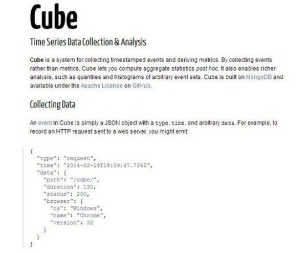
Cube
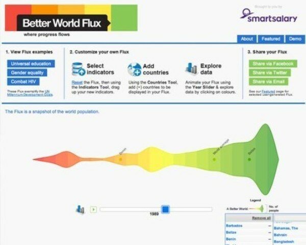
Better World Flux
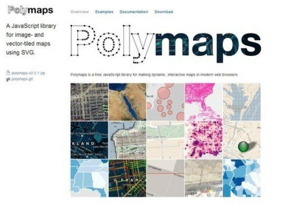
Polymaps
Google Charts
jQplot
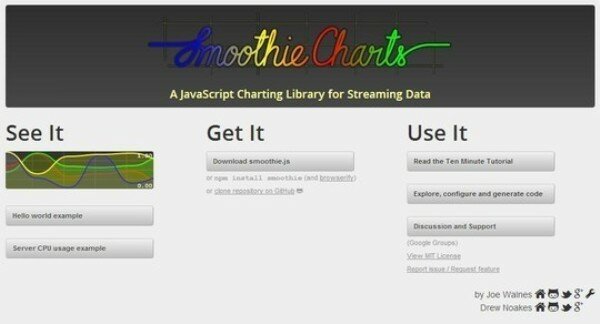
Smoothie Charts
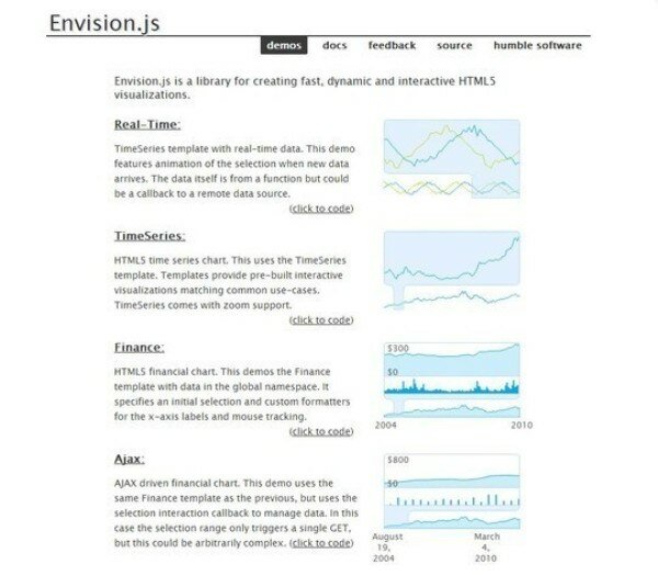
Envision
Arborjs
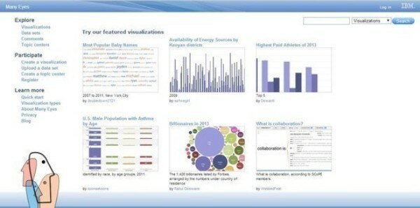
Manyeyes
D3js
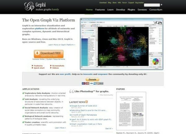
Gephi
Modest Maps
Flot Charts
Leaflet
Raphael
Cross Filter
Open Layers
Fusion Charts
Raw
Springy
Pizza Pie Charts
Chartkick
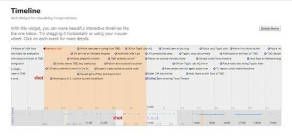
Timeline
Wolfram Alpha
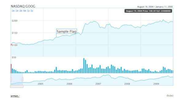
Humble Finance

